FIFTEEN:
7. AEOLUS (AGAIN)
THE HEADLINES
SEPTEMBER 22
Hi Mom,
I’m not quite done with episode 7 in the newspaper office yet. I want to share a little about the headlines, and give you a taste of the 1922 headline style.
According to my big book of annotations, the headlines were added when the novel was in galleys. Joyce added the headlines to the proofs in red ink. Slote et al say Joyce “was clear that the headlines were to be set in large and bold type. The only comments he made to the printer about their size were to request even larger” (216).
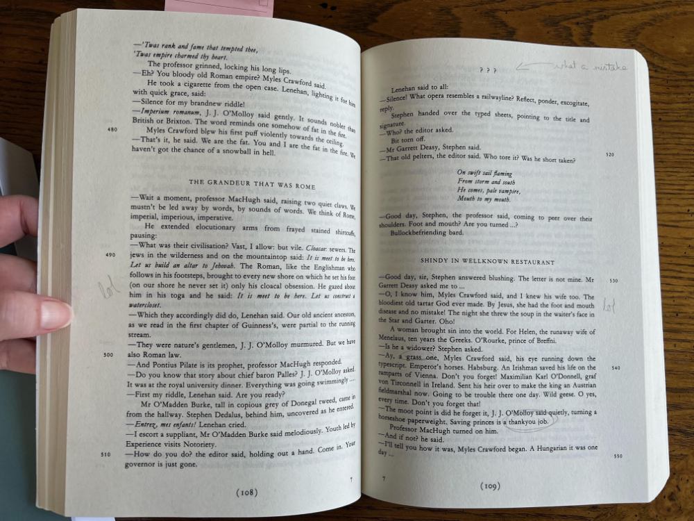
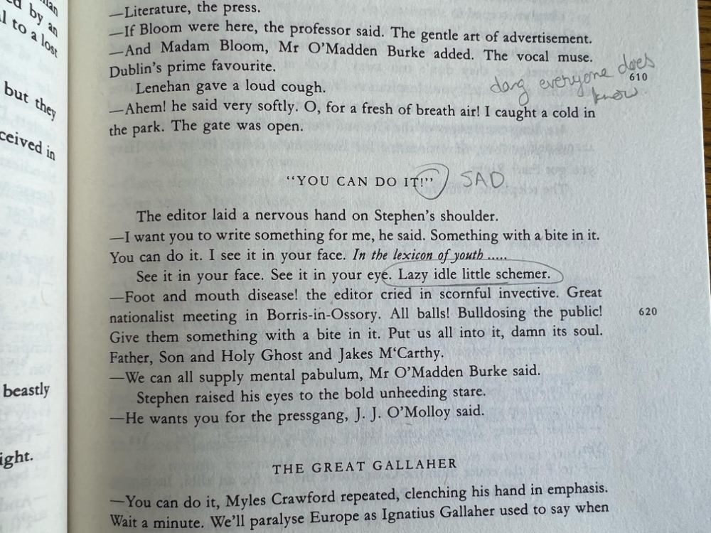
So it’s sad to me that our Gabler editions have such dull little headlines—merely all caps and not even bolded.

For all Gabler’s snooty defences in the Note on the Text (“this critically edited text of Ulysses stands, and remains standing, as the result of its considered premises and reasoned scholarly procedures” [which is basically academia-speak for kiss my royal Irish arse]), it feels like a real misstep to not honour Joyce’s clearly stated intentions for these headlines.

The pathetic quotation marks around “YOU CAN DO IT!” seem especially “SAD”.
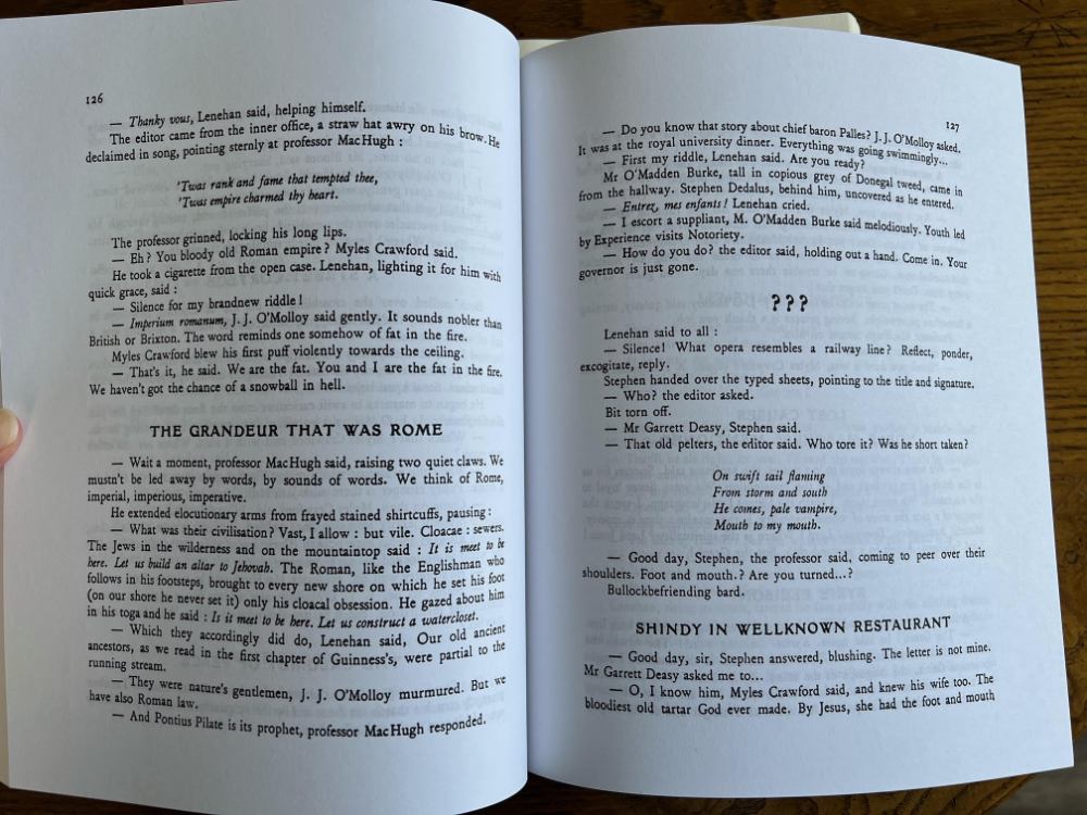
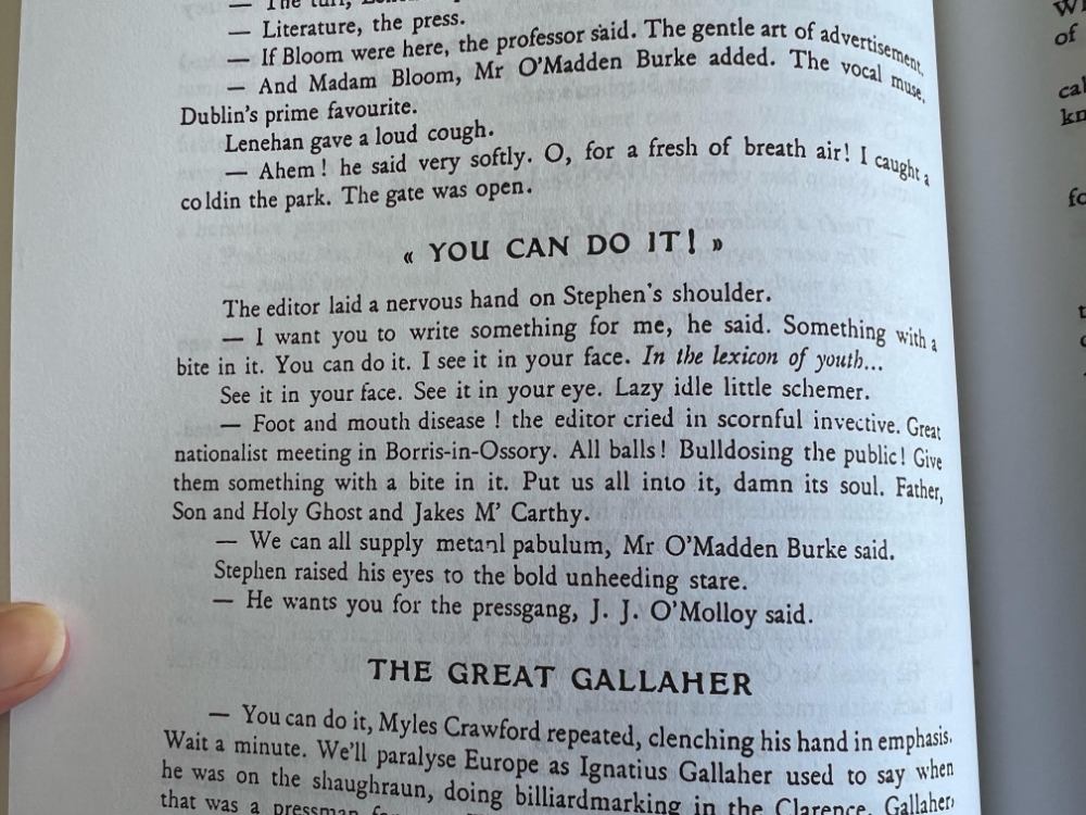
In comparison, here’s how a facsimile of the first edition from 1922 looks:

Look at those questions marks POP on the page.

I particularly like the look of the quotation marks in the large bold type of the ‘22 printing. Appropriately emphatic.
I’d hoped that acquiring a facsimile of the first edition would answer some questions for me, but really it’s all just curiouser and curiouser. Gabler (or, more likely the publisher) seems to have not cared about the embodiment of the text; I feel I won’t understand Ulysses until I’ve come to know it as a book and not just words.
I’m contemplating a field trip to Berkeley or Stanford to see what I can see in the Rare Books room. Really trying to prevent myself from buying more editions—it could get expensive!
K.
SEPTEMBER 23
Thanks for this... a great read! Must say I feel guilty for not paying much attention to the headlines as I read. They seem so disconnected.
Wondered at their significance. Obviously important to JJ.
SEPTEMBER 25
I spent yesterday morning writing to you about our long zoom conversation and about Ulysses, and after 1400 words realized I'd conflated two episodes. Here I am Monday morning to see what I can salvage out of that nonsense.
You wrote of episode 7 in the newspaper office “Must say I feel guilty for not paying much attention to the headlines as I read. They seem so disconnected. Wondered at their significance. Obviously important to JJ.”
That you didn’t pay “much attention to the headlines” as you read was definitely influenced by the design of the book itself. Folks these days talk about the importance of ‘visual hierarchy’ in web design—using the relative size, location and spacing of visual elements to direct attention and increase ease of reading/ locating information—but really that’s just a continuation of the use of visual hierarchy in written material going back to the beginning of the book.
This is what I’m getting at when I complain that the Vintage Press Gabler edition that we have doesn’t make the headlines BIG AND BOLD like JJ wanted. They aren’t printed in a way that makes you pay attention to them; the lack of visual hierarchy basically guarantees that you’re going to not see them in the way that you’re supposed to. JJ knew what he was at when he kept saying ‘bigger and bolder.’
And even based on my relatively limited knowledge of Uly, it seems clear to me that the headlines are significant to him. Ulysses had been published in serial form in a literary magazine, and this newspaper office episode underwent significant changes between its serial version and the first edition. I can't imagine him taking the time if the headlines weren't significant.
We do know from the schema that the technic for this episode is rhetoric, and at least some of the headlines are examples of different rhetorical devices. I'd supply an example or two but I'm trying to power through the Uly stuff this morning so I can get back to writing website copy and sales emails. LOL.
K.
SEPTEMBER 25
For what is worth I went back and selectively reread the headlines and some of the related text.
Windy and rainy here! Housebound. Downloaded Pynchon's Bleeding Edge. Enjoying reading a 'real' book! Sorry JJ!