FOUR: BOOK COVERS
SEPTEMBER 6
Hi mom,
Looking forward to reading your bio! But I know yesterday was a big day for reasons we won't mention here; suffice to say, I understand if you need a minute.
In the meantime, I owe you an apology.
The edition of Ulysses that I chose for use to read has got to be the ugliest book on the planet. I am sorry for bringing something so hideous into your life and your lovely home.
To give you the full shock of the pure abomination, I am first going to show you some beautiful book covers.
Behold the Aegean blue of the first edition:
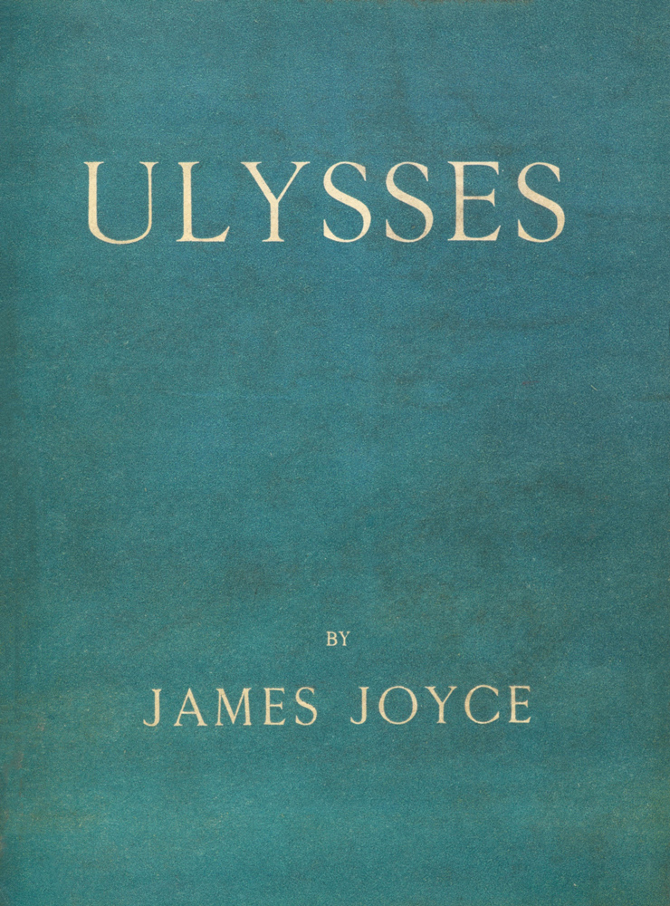
There's someone who suggests that the carefully-chosen blue is not merely a reference to the Greek flag, but also perhaps a reference to blindness and glaucoma.
And although the first American edition of Ulysses goes in a different direction, it is well-designed in its own way.
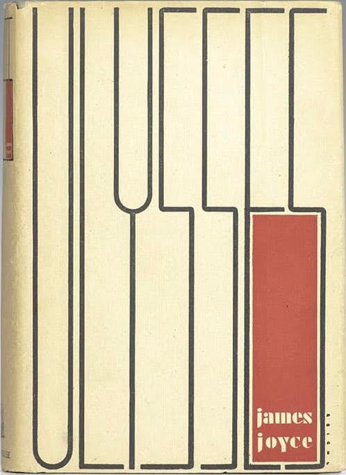
Read about that design here.
Books about Ulysses can be equally beautiful.
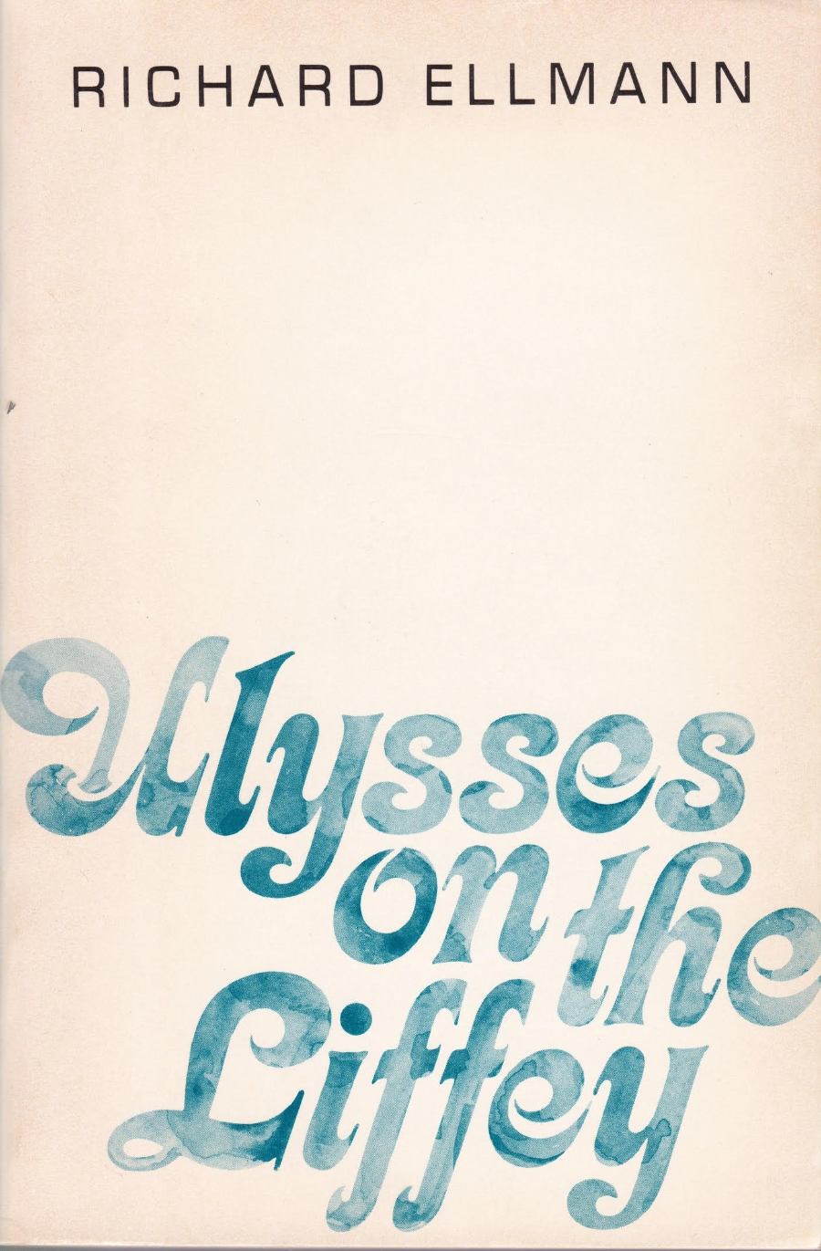

So simple and perfect.
So it is with great regret that I show you this cover. I assure you it’s worse in real life.
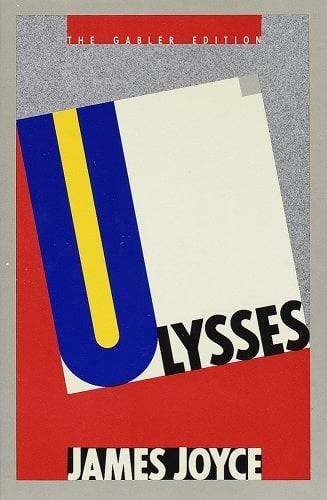
This is the Gabler Edition. This is *the* version of Ulysses that a whole team of scholars took seven years to produce. It is *the* "Critical and Synoptic Edition" that claims to be the correctest and accuratest version. It is, according to Joyce biographer Richard Ellman, "an absolutely stunning scholarly achievement." And it looks like this. What a goddamn eyesore. It's like, after all that time and work, they handed the book to the most junior, most coked-up publishing intern in Greenwich Village.
If you stare at it—and its predecessors—long enough, it slightly makes sense. There is some blue (even though it's the wrong blue). There is the dramatic U and the red of the first American edition. But the rest of it? The slab font, the sage green that matches with nothing else, the television static (?) grain. Literally what. Like what is this?
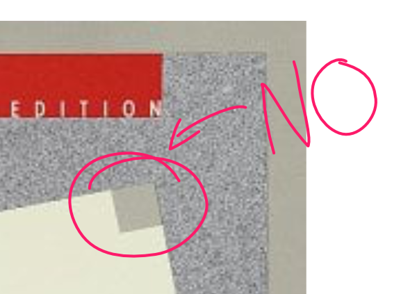
That little grey square is particularly egregious. As is the kerning. Do you see how the L overlaps the U a little bit? and the outside curve of the S poking out over the static? Revolting.
There is something a little Bauhaus-ish about the red-yellow-blue combination; perhaps the designer wanted to honour the West German roots of the edition? And yet produced something that achieves none of the Bauhaus principles.
If we lived in the UK, it could have been marginally better:
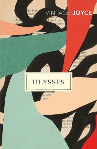
It's certainly on-trend, what with that blob look. I'm not mad at the typefaces, although making it look like the book was written by "Vintage Joyce" is silly.
I give you this covers tour today because [your local independently-owned bookstore] has let me know that your very own special-ordered ugly-assed copy of the Gabler Edition is arriving soon. They’re going to telephone you when it is available to pick up.
You’ve been warned.
K.
SEPTEMBER 6
Guess we will have to follow the well worn phrase, "Don't judge a book by its cover!"
Been thinking of the bio... you should have a first draft in a day or two. Dragging my heels
Mom